Page templates
In Randio Open Templates
The catalog page is where a customer sees their whole catalog on your store and adds products to the cart. The email button and the storefront block both link to it. Randio creates the page in your Online Store for each campaign and keeps it in step with the campaign's runs. One template is one document: the page, the email, the storefront block and their settings, edited in five tabs: All, Page, Email, Storefront Block and Settings. The Page tab designs the page.
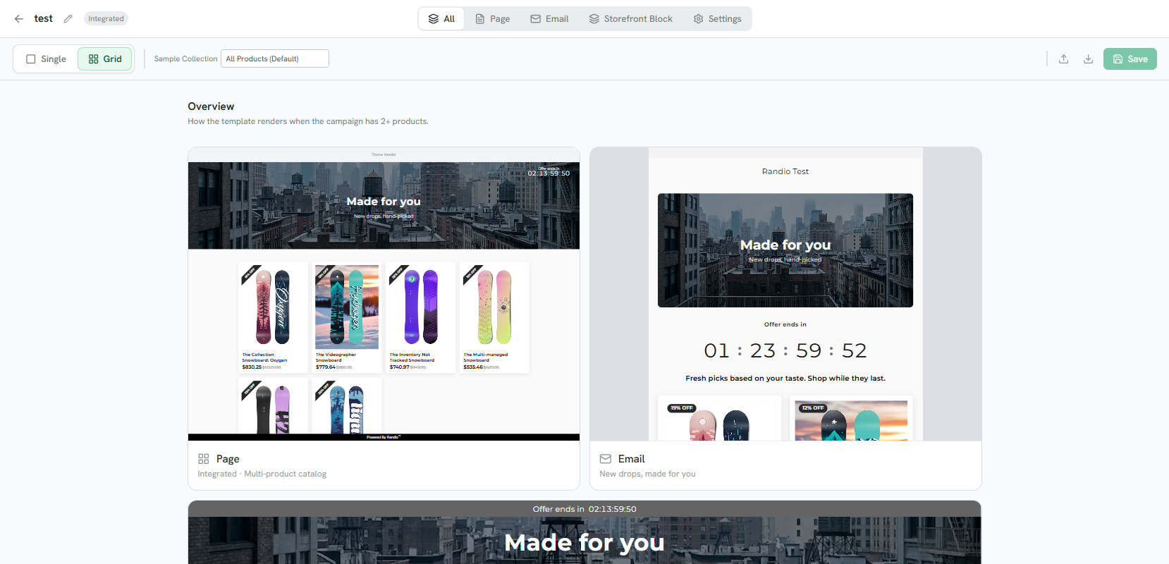
1 One editor, five tabs: everything, the page, the email, the storefront block, and settings.
2 Single or Grid, and the Sample Collection the previews draw products from.
3 The page, rendered from the design.
4 The email, from the same design.
5 The storefront block, below.
Surface
Each template has one page surface, chosen when you create it and changeable under Settings:
- Squeeze Page: a standalone Randio page with its own header, footer and cart drawer. Nothing else to look at.
- Integrated: embeds inside your Shopify theme. The theme owns the header, footer and cart, so the designer hides its Background, Header and Footer sections.
Layout
The campaign's strategy decides the layout a page serves: a catalog with one product renders Single, the one-product layout with the hero beside the product; two or more render Grid. The designer has a view for each, so you design both; the Single view previews one or two products.
What you can design
The designer works in sections and counts what you changed from the defaults. Its sections, by the names in the sidebar:
- Header: logo or store name, where a click on it goes, and the expiration timer with its formats, styles and label languages.
- Hero Banner: heading, subheading, a note about the discount limit, the suggestion shown to guests to log in (message and button), position, height, background image and overlay.
- Product Grid: desktop columns from one to four, mobile columns (auto, one or two), card spacing, a banner about the discount limit, and the empty state.
- Product Card: image ratio (1:1, 3:4, 2:3 or 9:16), padding, corners, shadow, hover animations, an in-cart indicator, and the discount label. The label can be a strip above the card, a badge on the image, part of the product info, or a corner ribbon, in one colour or coloured by discount tier.
- Product Info: the product panel of the Single layout, also shown in the Product Overlay popup when a shopper opens a card on a grid: add to cart and buy now, option buttons and swatches, quantity, image gallery, stock and pre-order messages.
- Background, Footer and Cart Drawer on a Squeeze Page, and Theme for the fallback font.
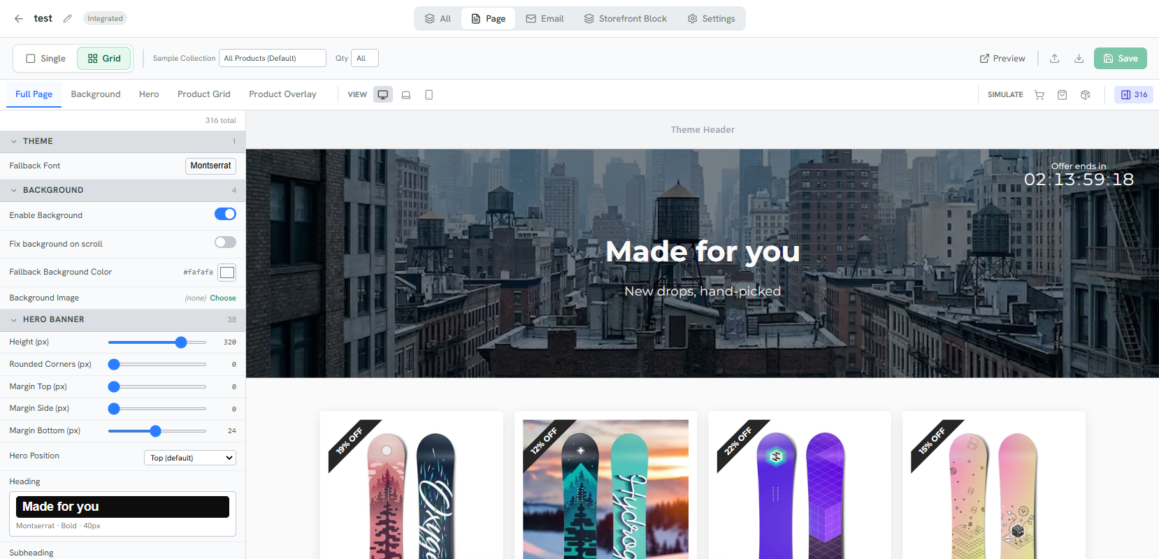
1 The page's sections; each one scrolls the sidebar to its settings.
2 Desktop, tablet and phone widths.
3 The settings, counted against the defaults.
4 The live preview, with sample products.
5 Preview on storefront opens the saved design in a new tab.
Preview on storefront opens the saved design in a new tab, so save first. Sample Collection picks the strategy the preview draws its products from, and Qty the number shown: on Grid all of them or a count, on Single one or two. A design can be exported and imported as JSON.
Starting points
New Template asks for a name and a surface, then offers samples: Default, New York, LA, Lifestyle, Adventure, Atelier, Bold, Premium and Urgent, or a copy of any template you already have. Everything is editable afterwards.
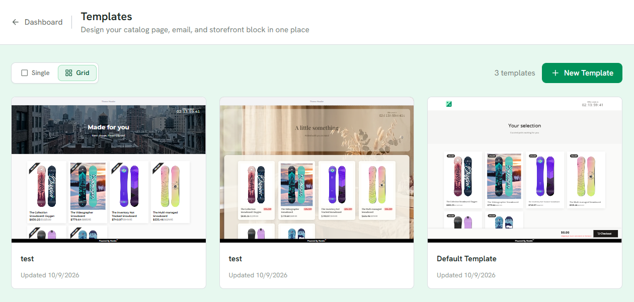
1 Preview the list as Single or Grid.
2 Each template, previewed with your own products.
3 New Template asks for a name and a surface, then offers the samples.
Templates in use
A template a campaign is using is held when you delete it: the campaign keeps running on its last copy until you pick a new template. A run records the design it went live with. Edits to a template reach a run that is live, and a run's page lets you switch it to another template.
See Squeeze pages, Storefront block and Email templates.